The Opus list
Opus 1-15
| |
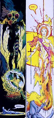
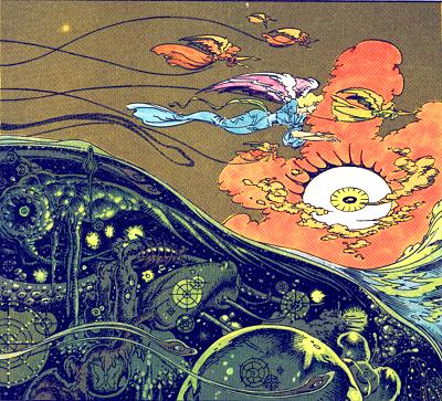
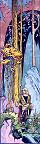
1 The Chimera,
1973-76, Earth Art Graphics.
A 10-plate portfolio.
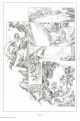
 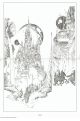
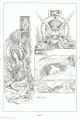
| PCR's comments:
|
| Originally a graphic story printed in portfolio form, The
Chimera would see publication by Eclipse Comics in 1982.
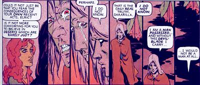
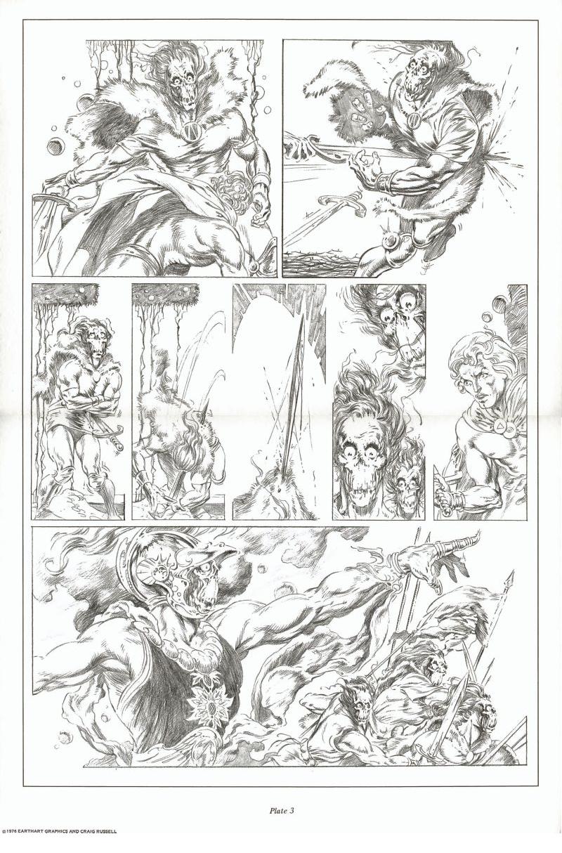
Conceived as a symbolist fantasy when written in 1973, the
work was influenced by the Belgium-French movement of the
late 19th century (Toorop, Kupka) and the music of Wagner
and Bruckner.
I began thisand completed itin Cincinnati after finishing
my first year with Marvel Comics... doing such classics
as Ant Man, Iron Man and Chamber of Chills.
Starting in the spring, I had plotted and drawn the first
20 pages of what would later become the first Dr. Strange
Annual. I had gone to the 4th of July convention in
NYC and visited the Marvel offices where Roy Thomas accepted
it for future, unspecified use. Back in Cinncinnati, I finished
my final semester at the University (my final grade was
a "D" in "Art Appreciation" but that's another story). I
had recently come across a book called Dreamers of Decadence
by Phillipe Jullian. It was a history of the Symbolist movement
in art in the late 19th century. I had four years of art
history classes under my belt, yet was completely ignorant
of this movement. Symbolism as a movement had gone head-to-head
with Impressionismand as history is written by the victorswas
relegated to the museum basement and hardly heard from until
the psychedelic 60's. The book and its pictures was a revelation,
and under its influence I began work on the Dr. Strange
story and then The Chimera.
I began it in the traditional way of pencilling and inking
but designed it to be finished in pencil. This meant it
had to be entirely drawn in blue pencil first and then 'inked'
in pencil. Standard reproduction in those days had no tolerance
for pencil drawing, at least in mainstream comics, but I
wasn't doing it with an eye for publication. I was doing
it because it seemed to be the right way to do the story...
and I wanted to see what it would look like in the softer,
more evocative look of pencil. Being at the same time a
practical person I thought that if someone did want
to publish it, then it would have to be inked.
When I moved to NYC in 1974, Bill Dubay, editor at Warren
Magazines (Creepy, Eerie) wanted to pick it
up, but on seeing samples of my inks thought I would not
be up to inking my own work (he was right)and suggested
Wally Wood, who was then doing some work for them. Of course
I said "yes" to that, but it never happened. In retrospect,
I'm glad it didn't. In 1976, a small company called Earth
Art Graphics approached me to do a portfoliowhich were
just then becoming the rage. I sent the piece to them and
until the advent of computers, laser scanning, etc. it was
the best reproduction of pencil drawings I had ever seen.
A few years later, Eclipse Comics reprinted it in Eclipse
Magazine. They shot from the portfolionot the originalsand
the result was very bad. Really ugly. Avoid it. Finally
I named this piece the forward-looking "Opus 1" because
it was the first completed piece thatfor better or worsewas
entirely my own.
|
|
|

|
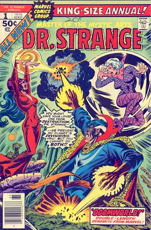
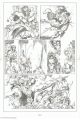
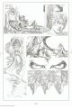
2
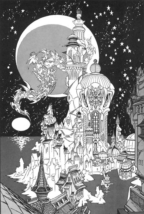
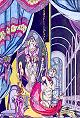
Dr. Strange - Annual
1, 1973-76, Marvel Comics.
Reprinted in black and white in Essential Doctor Strange
Volume 3, Marvel, 2007.
One of the first comics published by Russell's, this one has
a convoluted history : Russell began working on it all
by himself in 1973, before drawing what would be his opus 1.
Then, years later, it was accepted by Marvel and reworked as
an annual, scripted by Marv Wolfman. And it shows : there
are far too many words in there, especially in some emotionally
powerful scenes which would have deserved to be silent. But
that's a flaw common to a lot of mainstream comics. Anyway,
Russell's art really shines here. The fantasy world on which
Dr. Strange finds himself has some great architecture, and the
witches are directly out of a Disney film. One can feel that
this kind of story really fits Russell's sensibility.
Russell would come back to that seminal work some twenty years
later with opus 43.
| PCR's comments:
|
|
I'm not certain why I labeled this Opus 2. I started it
before Opus 1 but didn't finish it until after completing
the Killraven series (Opus 3). Guess I compromised
and stuck it in the middle.
I started it in the winter/spring of 1973... and for better
or worse consider it the first of my own major works. That
is, the first story I began that was my own storynot a
company assignment. It wasn't commissioned and I had no
guaranteeor even much thought ofever seeing it in print.
I did it for my own enjoyment and for the chance to draw
to my own interests. As a result, the quality of my work
took a giant leap forward.
I was still going to school but had only a few easy courses.
I remember working on this up until the 4th of July comics
convention in NYC. I took the 20 completed penciled pages
up to Marvel and showed them to then Marvel Editor-in-Chief
Roy Thomas. He said almost immediately that they could use
it. Leave it there and voucher for the sum of $20 a page.
Great. I had no idea of the political minefield I was wandering
into. Of course, the regular series had a regular writerSteve
Engelhartand of course he had his own continuity worked
out. I'm sure he wasn't happy when he was given the pages
by Roy and told to do something with them. Of course he
did nothing, at least for a while.
A couple years passed and the first issue of a new Doctor
Strange series hit the standswith art by Frank Brunner.
I opened it and thought, "great, here's my splash page,
they've decided to use my artwork." Then I noticed the credits
and the rest of the pages... not mine, save for one panel
further on. They weren't using my story, just sort of piecing
on it. I complained to Roy who admitted that , yes, there
was a striking similarity to my pages. Time passed. Then
in '76, I was informed there would be a Doctor Strange
Annual and they would be using the 20 pages of my projected
60 page story and Marv Wolfman and I would be reworking
the story to fit the planned 35 page book. Okay. We did.
I was given the (remaining) penciled pages back and added
the 15 new ones.
My style had changed a lot in the last three years so it
was a challenge to try to make it all work together. Luckily
none of it had been inked so there was that patina to add
that gave it some consistency. I was allowed to color it.
I guess I had passed my coloring probationary period (see
opus 3) and did it all in a week. All that remained was
the cover. The one I had done in '73 was no longer viable
(used on the cover of Bob Layton's fanzine with my first
interview, another gruesome story). I did a new one of the
Doc and 'Lectra in combat. Marv said he wanted to see Clea
in the background, trapped in a mystic bubble. It didn't
work for me, so I left it out. I showed the finished cover
to art director John Romita who approved it and then proceeded
to the San Diego con. Saw Marv there. All smiles. All's
right with the world. Returned to NYC. First trip to Marvel,
Duffy Vohland comes up with a big grin. "Did you see the
make-ready for the Doc Strange cover?" No. He shows me.
Its a Dave Cockrum redraw from my design, ugly as sin, with
Clea in the background, trapped in a bubble. The trouble
with working with a writer who is also your editor is that
when there is a creative disagreement and you go to your
editor to decide the best course... guess who wins?
The book came out in the late summer of '76, I think, and
the original art was returned to the Marvel offices some
time after that. Now Marvel had only been returning the
original art to the artists for a few years and part of
the deal was that the writers were to receive a portion
of the art. They were closest to administration in the daily
workings of the company so guess how that happened? Anyway,
for some reason, probably due to deadlines, I had inked
the work before it was lettered. The lettering was done
on separate sheets and pasted down with some sort of white
paint and rubber cement (back when rubber cement was rubber
CEMENT) Anyway, I was told by Mary Beth (the art 'girl')
to pick up my pages when they came in. I didand then asked
if she cared if I took the other pages to make copies. She
said fine. I put them in my portfolio and went home. Spent
three days with rubber cement solvent and a razor blade
and removed 35 pages of balloons. They curled when removed.
Made a foot-high stack of curled-up word balloons. I put
them in a brown bag and returned to the Marvel offices.
Left it on Marv's desk with a note. "Here's your share of
the artwork."
It's a small art village we live in and within 15 minutes
the story had reached DC comics and Neal Adams Continuity
Studios. Days later, back at Marvel, Marie Severin started
laughing when she saw me, and Marie knows how to laugh.
She said Marv stormed in, red in the face, shaking the bag
of balloons, saying "did you see this, did you see this?"
I wonder if Marv still has them?
|
|
|
|
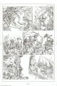
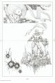
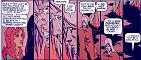
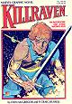
3
Killraven - series
(Amazing Adventures Featuring : War of the Worlds 27-37,
39), 1974-1976, Marvel Comics.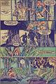
Collected in Essential
Killraven vol. 1, 2005, Marvel.
When comics still adapted books and not only films or TV series,
the results were sometimes worth it. Set in H.G. Wells's War
of the Worlds, this short-lived series was nonetheless a
high point of the 70's Marvel. Don McGregor's stories, pitting
a band of ill-assorted humans led by the volatile Killraven
(a gladiator alias) against the flesh-eating Martians, were
full of strangeness and anger. Russell's work on this title
went from interesting to downright fascinating. He was the perfect
choice to illustrate the psychological and inhuman horrors concocted
by McGregor.
Both authors would reunite for a last Killraven story - see
Opus 13.
| PCR's comments:
|
|
Killraven/War of the Worlds was my first real collaboration
with a writer. My previous Marvel projects were typical
assignments with a plot synopsis and little interaction
with the writer. Don McGregor was the first person that
seemed to be excited to work with me, but then Don was excited
about everything.
At Marvel, in those days the artists may have been somewhat
fawned over but it was the writers who ran the show and
in Don's case, fought the battles. He seemed to be continually
under siege by editors wanting to impose their stamp on
his ideas. It made for some strange compromises. On the
issue 'A Death in the Family' he wanted the entire issue
to be without word balloons, text and pictures only, as
in Hal Foster's Prince Valiant. For some reason it was thought
the Republic would fall, Marvel would capsize, and Stan
would lose his hair if such a 'radical ' approach was used...
so word balloons were added to pages 2 and 3. I guess so
that people would know they were reading a 'real' comic
book. I was generally left alone except for the covers which
were subject to what was perhaps Marvel's most formulaic
phase, i.e. "the hero at the mercy of the villain". Yawn.
The great advantage to working on a series like this was
that it was so marginal to mainstream Marvel that, Don's
battles not withstanding, they left us pretty much alone.
Other artists may have been angling for more 'prestigious'
assignments but I was happy right where I was. I may have
been happy but that doesn't mean I was always responsible.
I was constantly missing deadlines, resulting in fill-in
issues, reprints, layouts for other artists to finish and
the use of other inkers to give me extra time. The only
thing that saved my butt was that Don was even slower, and
after all, this wasn't a Marvel flagship title. It was the
last time I ever had anyone else ink my pencils and it was
the last time I ever missed a deadline (knock wood).
The challenge for me on this series was that I was forced
to stretch and draw characters and situations I wouldn't
have attempted while playing to my strengths on projects
like Dr. Strange. It was a constant learning experience
and the drawing style seemed to change every issue. I was
going to 4 or 5 movies a week at the Bleeker Street Cinema
and going back to the studio to lay out pages. It was midway
through that I began using live models for some of the characters.
Not having a camera yet, they were forced to hold some seriously
ridiculous positions as I drew them on the comics page.
It was Don who convinced me to try my hand at inking on
my 2nd issue. I was convinced I couldn't ink based on my
experience with my mentor, Dan Adkins. Dan used a brush,
it seemed everyone did, and all my attempts had been...
not good. But I had inked one 'special effect' panel and
on the basis of that, Don talked me into it. I had used
a pen on that panel so it seemed OK to continue with one.
If it wasn't a Hunt's 108 flexible crow quill then, it very
soon was. I've used it ever since.
It was desperation that got me to attempt my first coloring
job on that same 2nd issue. It was going to be sent to a
house hack and I knew that I couldn't be any worse. I asked
Marie Severin (head colorist) if I could give it a try.
Dubiously, she asked if I knew anything about coloring.
I said it was all I had studied for four years in college
(lies lies lies). She gave me a coloring set and some simple
coding instructions and I found a desk. I started working
on page one, coloring it completely before moving on to
the next page. Linda Lessman was coloring across the room
and I could see her glancing my way now and then. Finally
she came over and in a low and very polite voice asked if
I would mind if she made a suggestion. She told me to go
through the entire story and color all the flesh tones at
once, then go back and do all the costume colors one at
a time straight through. If that sounds coldly 'assembly
line' it wasn't. Given the nature of reproduction and our
limited and oftimes inevitable color choices it made perfect
sense. The way I was doing it, one complete panel at a time
(open the bottle, paint, close the bottle, open another,
paint, close,) would have taken forever. She was so sweetly
apologetic about correcting this naive dolt that I've been
her obedient servant ever since.
As it was, I spent about 48 hours in the Marvel offices,
sleeping in the reception area, getting up when the suits
would arrive in the morning. They were very relaxed about
coming and going then and people would frequently be there
late at night. While I was working on that coloring at about
3 in the morning Tony Isabella kept me company by verbally
listing all 75 issues of Daredevil that had been printed
to that point, which villain's had been featured in each
of those issues and why he would or would not be using each
of those villains when he assumed writing control of that
series. Don't tell me I haven't paid my dues.
The 3rd issue of KR I also colored, having got a grip on
the color coding system, but without all the subtleties
that made it easier for the engravers to apply the colors
to the printing plates. At any rate I used every color available
and didn't skimp on the detailing. I was later told, in
tones of horror and indignation that Marvel had been charged
$100 extra by the printers. It was the only time Marvel
had ever been charged extra for a coloring job. $100! Such
extravagance. Who did I think I was... Erich Von Stroheim?
My coloring career was temporarily shelved, but we got Petra
Goldberg, later Petra Scotese, who always did a most sensitive
job. Ever since, when working on inking jobs, I've always
asked the editor if she's available.
If I had to pick a favorite of the series I would choose
'A Death in the Family' for its integration of art and text...
for once Don and I weren't jockeying for space on the page,
Petra did wonderful coloring, and I was learning how to
tell a story with pictures.
|
|
|
|
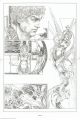
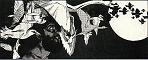
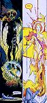
4
Dance on a Razor's Edge, 1977, Eclipse.
In Night Music 2 (color), 1985, Eclipse.
Available in the collection Isolation
and Illusion, 2003, Dark Horse Comics.
A meditation on Yukio Mishima's death. This Japanese writer,
one of the most famous of the post-war period, wrote a large
number of novels showing his views on life, love, and, well,
everything else. He was also gay - and married, obsessed
with Saint Sebastian, a common affliction among cultured gays
of bygone times. Russell's 6-page story frames highlights of
the writer's life with his ritual suicide by seppuku.
| PCR's comments:
|
|
Dance on a Razor's Edge was, after Killraven
and Dr. Strange, a new direction. It came about when
Al Milgrom asked me to contribute to an "underground" comic
he was producing that would include contributions by Wrightson,
Starlin, and Simonson. At that time I had been reading everything
I could find by author Yukio Mishima. Plays, novels, short
stories, essays and a few biographies. He had committed
ritual seppuku in 1970after leading his private right wing
army in a failed attempt to commandeer a military base in
an attempt to topple the Japanese government!
I was fascinated by everything about him. I conceived the
idea of staging a suicide while intercutting events from
his life and from his writing. After the myriad characters
and plotting of an issue of Killraven, I wanted to
concentrate on a single character in one room.
It was the first time I photographed a model. I took the
photos before writing the story, concentrating on getting
as many possible angles as I could. The model was performing
the very simple action of drawing a knife across his belly.
I had in mind film director George Steven's method of shooting
a scene from six angles, simultaneously, and then spending
up to a year(!) editing it all together. I didn't take that
long as it was only eight pages.
I finished it in '77 and thenas has happened several times
in my careerwaited for everyone else to come through. Didn't
happen. A couple of years later Neal Adams suggested I send
the story to him in New York (I was living in Wellsville,
Ohio, at the time). He had a possible foreign publisher.
I sent him the pages. Nothing happened. A few years later,
when I was beginning the Night Music series for Eclipse
Comics, I called his studio and asked for their return.
Only three pages could be foundthe others were "misplaced."
I had overexposed photostats of the missing pages so we
used those for publication... and added color to a story
that was designed for black and white.
Years passed. In the spring of 2001, I received a question
on this site's message board from an art collector who had
recently acquired five pages of my art from a story he was
unfamiliar with. Featuring a character called Kimitake.
After 20 years, the pagesall intacthad bobbed to the surface.
Upon hearing that the pages had no doubt been stolen from
Continuity Studios, this very standup gentleman returned
them to me.
Reunited at last, I hope someday to see the story published
in its original black and white form. As to where the pages
have been and who might have removed them from Neal's studio?
I have entertained one dark but amusing theory... which
I will share with you if we become friends and you pour
enough beer into me.
|
|
|
|
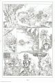
5
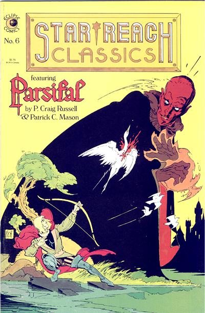
Parsifal, 1976-77, Star*Reach and Eclipse.
 Reprinted
in Star*Reach Classics 6, 1984, Eclipse. Reprinted
in Star*Reach Classics 6, 1984, Eclipse.
In Opera. Also in The P. Craig Russell Library of
Opera Adaptations vol.2 (see Collections).
An adaptation of a part of Richard Wagner's last opera, this
is a remaking of the story of Perceval, one of the main characters
of the legends surrounding the Grail. Already in place in this
early work of Russell's are the use of vegetation for the psychological
settings and a female character on the wrong side of the Force,
if I may use that term. Femmes fatales are aplenty in
Russell's works, among others Salomé and the evil sorceress
in both Dr. Strange stories. The drawings might still be sometimes
awkward, and that can also be said for later works, but the
storytelling, the composition of the page, and the beautiful
backgrounds far outweigh that nagging weakness of Russell's
first years.
| PCR's comments:
|
|
The story is based on the second act of Richard Wagner's
last opera, Parsifal. Art and visual direction
by P. Craig Russell. Story adaptation and script by Patrick
C. Mason. Lettering by Tom Orzechowski and Annette Kawecki.
Parsifal was my first collaboration with Patrick
Mason and my first opera adaptation. Sometime in 1975 or
'76, Patrick handed me his prose adaptation of the 2nd act
of Wagner's Parsifalsuggesting I use it if I so
desired. About that time Mike Friedrich was starting Star*Reach
comics and asked me to contribute, so the timing was good.
Its different from later opera adaptations in that it has
a prose narrative that can get inside the character's heads
the way pure dialogue cannot. Most of my adaptations fall
into one of two camps. Narrative prose (Human Remains,
Golden Apples of the Sun, Elric) in which a wealth of
descriptive prose can be sifted through to amplify or explain
the characters actions. The difficulty lies in what to throw
overboard, especially with a writer like Ray Bradbury when
every line is so lovely. The other camp is the play or libretto
(Salome, The Magic Flute, The Clowns) in which the
story is expressed and propelled solely through dialogue.
Once I complete a project in either camp, I look forward
to working again in the other.
Mike Friedrich accuses me of wanting to re-do all my
early work (see op.2 and op.43) but its only 2 or 3 pieces
I'd like to redraw. Parsifal is one of them. I was
going through stylistic changes, thrashing about really,
and I didn't know if I wanted to be Barry Smith or Bernie
Krigstein. A Pre-Raphaelite or a German Expressionist. And
it shows in places. It's a script that deserves better pictures.
Someday.
Parsifal was begun in NYC and finished in Wellsville,
Ohio in 1977.
|
|
|
|
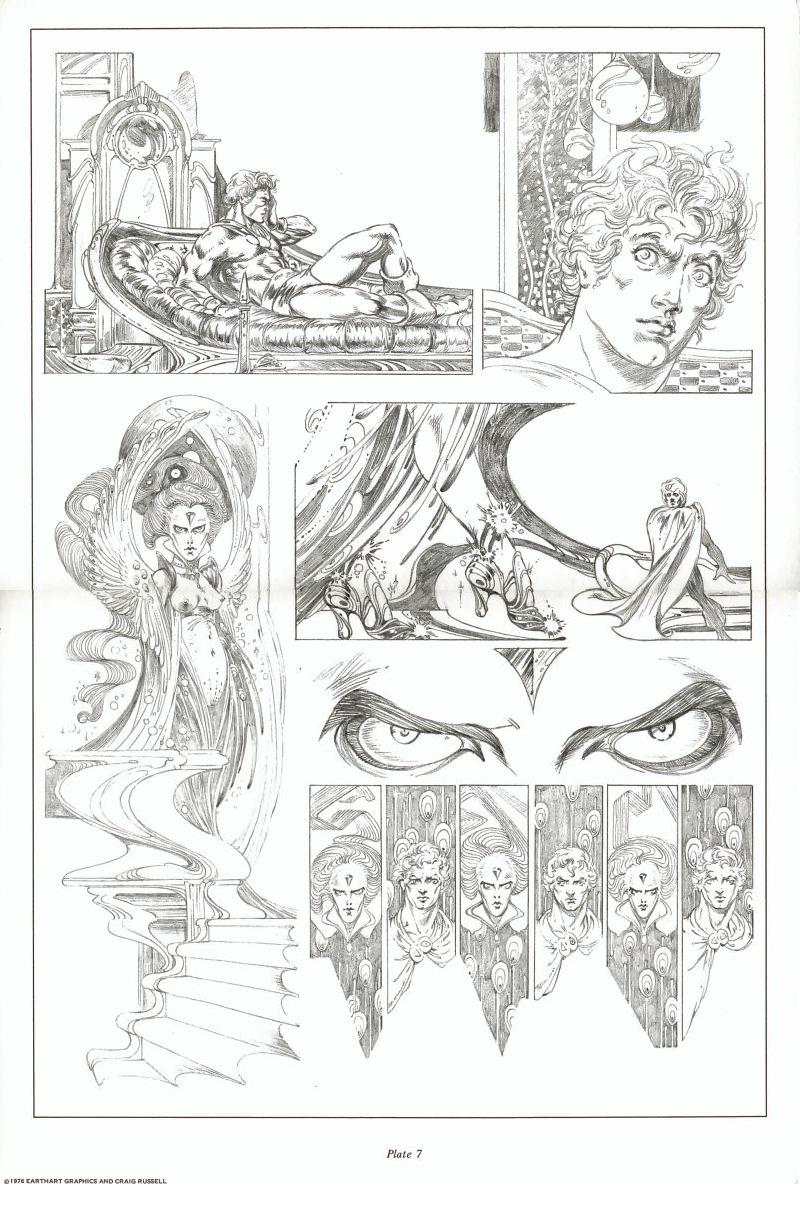
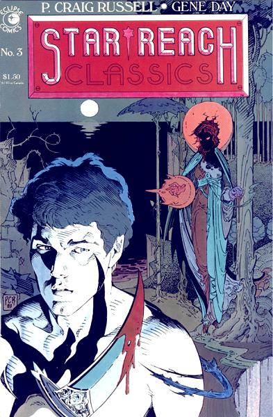
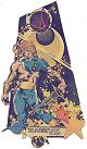
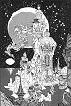
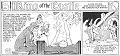
6 The
Avatar and the Chimera, 1978, Star*Reach and Eclipse.
 In
Imagine 2-3 (Star*Reach). In
Imagine 2-3 (Star*Reach).
Reprinted in its entirety - with a new cover - in Star*Reach
Classics 3, 1984, Eclipse.
A symbolist short story in which an animated statue by Michelangelo
(the Avatar) frees an imprisoned woman (the Chimera).  A model in Art Nouveau furniture
and Symbolist metaphors. Even early in his career, Russell's
main influences were unashamedly on display. A model in Art Nouveau furniture
and Symbolist metaphors. Even early in his career, Russell's
main influences were unashamedly on display.
| PCR's comments:
|
|
The Avatar and the Chimera was published
in two color installments in issues #2 and #3 of Imagine.
Entire work is by P. Craig Russell.
Avatar and the Chimera was done for the color sections
of Star*Reach comics. Star*Reach had become for me, in the
late 70's, the place to be free to try whatever struck my
interest. I'll always be grateful it was there. Avatar
was the second of my four wordless stories. It gave me a
chance to return to the Symbolist inspired world of Dr.
Strange and The Chimera, to be lost in fantasy.
Bernie Krigstein was out of the door. I was also doing a
lot of mainstream inking that year at Marvel and DC. I think
this was the only original piece I did that year, although
I may have worked on Siegfried and the Dragon also
and begun work on my anatomy/life drawing sketchbooks. I
remember when Star*Reach comics premiered. It was supposed
to be a place where artists could present mature, intelligent
work of the sort that the mainstream companies were not
producing. And of course the first issue presented Stephanie
Starreach, a mostly naked piece of cheesecake running
around. I was among those who rolled their eyes at this
embarrassment. How beneath us it all was. But then I had
no trouble turning around and presenting Avatar... running
around in cape, boots, and jockstrap. But it was for an
artistic purrrrrrrpose. A misfire... to contrast with his
later transformation from a lower to higher state of being
as symbolized by the golden armor he should have been clad
in animal skins. On a related note, that is exactly what
happens to Siegfried when he 'weds' Brunhilde. He enters
her cave in bearskin and emerges wearing her armor.
|
|
|

|
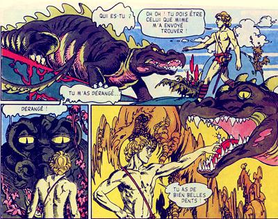
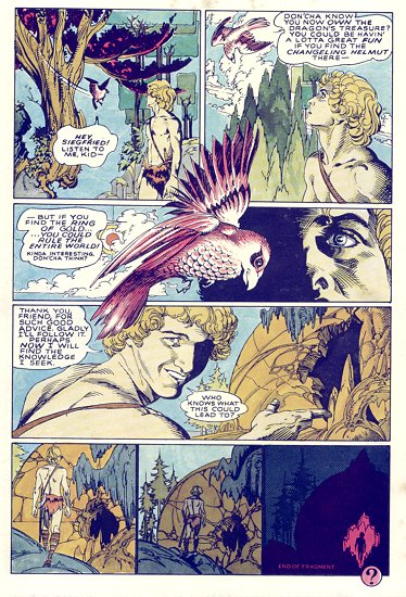
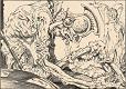
7
Siegfried and the Dragon, 1978, Marvel-Epic.
In Epic Magazine 2.
In the Marvel version, the last page is a full-page, with a
bird telling Siegfried to get the Ring. But there's an alternate
last page, rejected by Marvel, and published by Star*Reach in
Imagine #6, 1979.
 In
seven pages, Russell illustrates the episode of The Ring
of the Nibelung in which a young Siegfried kills the dragon
Fafner and, through the dragon's blood, becomes fluent in animal
languages. The storytelling is very effective, but the dragon
doesn't look very frightening. The overall ambiance is more
one of light fantasy than of a dark journey of the soul as in
Parsifal. In
seven pages, Russell illustrates the episode of The Ring
of the Nibelung in which a young Siegfried kills the dragon
Fafner and, through the dragon's blood, becomes fluent in animal
languages. The storytelling is very effective, but the dragon
doesn't look very frightening. The overall ambiance is more
one of light fantasy than of a dark journey of the soul as in
Parsifal.
| PCR's comments:
|
|
Art and adaptation by P. Craig Russell (from the story
by Richard Wagner). Lettering by C. Russell and Mary E.
Gordon.
My first attempt at cracking The Ring of the Nibelung.
I thought at the time that I would be able to incorporate
it into the larger piece when I got to it. Two decades later,
my style was too different for that to work and besides,
my original model was now as round as a washtub. For some
reason, when it was published in Epic Magazine the
final page (of Siegfried talking to the woodbird and entering
the dragon's cave) was dropped and my original cover was
substituted. I think the open end of the original was
not considered conclusive enough. That final page was
later printed as the back cover to Star*Reach's Imagine
magazine. A side note: It was just after this that I made
my first stab at laying out The Ring. I did the first
half of Rhinegold in about 40 pages. In 1996, when
I began work on The Ring in earnest, I took a look
at them. They were totally useless. At least I hadn't been
standing still for 18 years. Parts of the layouts to
Siegfried and the Dragon did make it to the recent,
final version.
|
|
|

|
8
La Somnanbula, 1979, Eclipse.
In Night Music (b&w, see Collections)
and Night Music 2 (color), 1985, Eclipse.
Available in the collection Isolation
and Illusion, 2003, Dark Horse Comics.
|
|
|
9
Breakdown on the Starship Remembrance, 1979, Eclipse.
In Night Music (b&w, see Collections)
and Night Music 1 (color), 1984, Eclipse.
Available in the collection Isolation
and Illusion, 2003, Dark Horse Comics.
A beautiful science-fiction story of a romantic astronaut lost
in the coldness of his steel-hearted colleagues, this 22-page
tale gives you two endings for the price of one. Russell uses
his character's childhood to pay homage to his heroes, among
them Al Williamson and Wally Wood. The art is very good, alternating
futuristic technology and depiction of heaven-like forests.
The two endings heighten the moral dilemma which the main character,
who has fled his duty and landed on a beautiful planet, faces
: stay on this planet, or try to live his childhood dreams of
discovering alien life, roaming the cosmos. One can note that
the doctor on the starship, who wants the astronaut back, has
the same name as the evil magician in Parsifal.
|
|
|
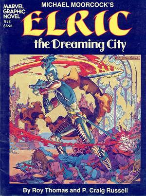
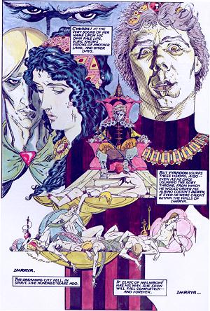
10
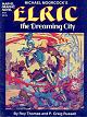
Elric - The Dreaming
City, 1979-80, Marvel.
A Marvel graphic novel adapting a Michael Moorcock's book.
The story of the albino warrior who has betrayed his race.
His weapon, Stormbringer, has become famous, and Dave Sim, Cerebus
own demiurge, has created such a funny parody of the white-skinned
wizard that one cannot look at a drawing of the sword without
breaking out laughing. Anyway. Not being very interested in
Fantasy, I must admit that the story, which has its moments,
did not captivate me. But Russell's artwork is so enthralling
that this does not matter. It is especially interesting to notice
the way he uses actual faces, for some of the characters, mixing
it with, for example, the gaunt visage of Elric or the evil-looking
Yyrkoon, the bad guy of the book. Russell will come back to
the albino and his tortured life many times. A summary version
of this story can be found in Opus 22.
|
|
|
11
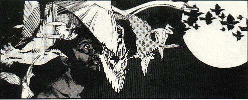
Isolation and Illusion, 1981, Marvel-Epic.
In Epic Illustrated 9.
Available in the collection Isolation
and Illusion, 2003, Dark Horse Comics.
One of the most beautiful story ever drawn by Craig Russell
- and I do not write that lightly - this tale is heavily
influenced by Symbolism, a XIXth century aesthetic movement
to which Russell has often paid his dues. In fourteen wordless
pages, the reader follows a winged man looking for his lost
love in a desolate city. He will meet white swans, dense thorns
and high-towered castles, but what about his love ? What
good beauty without the beloved, does the Dante Gabriel Rossetti
epigraph wonder.
Russell often draws handsome men, but here, he draws on classical
sources and achieves a Michelangelo-like beauty which one does
not often see in modern art. And the art is shot directly from
Russell's pencils. The result is all the more striking.
| PCR's comments:
|
| My fourth Symbolist Fantasy and the first work completed
after my move to Kent, Ohio. Winter and Spring of '81 I was
teaching a course in illustration at Kent State University
and seemed only to have time for inking work (Marvel Fanfare
#7, the Sandy Plunkett Spider-man/Dr. Strange story).
But by late spring I began work on Isolation and Illusion,
my first original work in almost a year (the previous Fall
had been spent coloring The Dreaming City). I began
it, like so many early projects, with no publisher in mind,
just for the joy of doing it. I had my studio in a dark, damp
basement but once I got going, looked forward to beginning
every day's work. I remember working on pages in a cabin by
the ocean in Ogunquit, Maine. Yes, I take my work on vacation.
The genesis of the story was the thought of what might have
happened to the angel character from the Dr. Strange Annual
after the cataclysm that concludes that story. As such Isolation
can be seen as a sort of pendant to the Dr. Strange Annual.
At the same time it can also be seen as a continuation (along
with Avatar and the Chimera) of the opus one Chimera.
No, I'm not trying to evolve a PCR universe, its just that
some stories seem to tie in with others. Marvel's Epic
magazine published it shortly after I completed it and
of all the pieces I've done this one seems to have inspired
the most devotion. At least I hear about it from readers most
often. The reproduction of the delicate pencil drawing was,
considering the technology at the time, not bad. This was
the last time (except for Unto This World) that I used
pencil so extensively until recently in sections of The
Ring of the Nibelung. |
|
|
|
12
Elric - While the Gods Laugh, 1981, Marvel-Epic.
In Weird of the White
Wolf, the second Elric paperback published by
the now-defunct First Comics.
Another short story starring the albino warrior.
|
|
|
13
Killraven - Last
Dreams broken, 1982, Marvel.
A Marvel Graphic Novel.
Collected in Essential
Killraven vol. 1, 2005, Marvel.
 An epilogue of sorts - there
should have been other stories - to the Killraven
saga (see opus 3), this bitter tale written
by Don McGregor does not resolve anything, but gives new hope
to the weary human warriors. Friendships and family loyalty
are at the heart of this story which Russell illustrates with
a lot of restraint, caring more for the humaneness of the characters
than the prettiness of a perfect drawing. An epilogue of sorts - there
should have been other stories - to the Killraven
saga (see opus 3), this bitter tale written
by Don McGregor does not resolve anything, but gives new hope
to the weary human warriors. Friendships and family loyalty
are at the heart of this story which Russell illustrates with
a lot of restraint, caring more for the humaneness of the characters
than the prettiness of a perfect drawing.
| PCR's comments:
|
|
Chapters 14 of "Last Dreams Broken" were presented
together in Marvel Graphic Novel no. 7. Story and
art by Don McGregor and P. Craig Russell (continued from
concepts by H.G. Wells). Lettering: Tom Orzechowski. Coloring:
Petra Scotse.
This second Killraven series was intended to be
serialized in Epic magazine. It was not meant to
be the conclusion to the series. About the time it was complete,
editor-in-chief Jim Shooter had a hole in the new Graphic
Novel line that needed to be filled and asked Epic
editor Archie Goodwin if he had anything that could be used.
There's been some confusion, because of the marketing/advertising,
that this was the conclusion to the series... but that was
never the intention.
Several years later we did plan on concluding the series
in a 64 page, eight chapter story to be serialized in one
of those monthly Marvel anthology books. Don began writing
and was soon well over 100 pages with Mars nowhere in sight.
I began drawing, but became concerned with the artificial
structure of a cliffhanger precisely every eight pages and
also that we had no guarantee the chapters would ever be
collected in one book. Marvel refused to commit to such
a collection and in light of thatand the ever expanding
size of a project that would only be seen on cheap paper
in little bite-size chunksI dropped out. I always like
to finish what I start (see Elric) but this one was
not to be.
What I liked best about this project as compared to the
original KR series was that I got a complete script from
Don before I began drawing. That way I was able to avoid
the hazards of designing a page without knowing how much
or where the dialogue was going to go. I also had fun with
the three photo montage pages at the end of the story. Of
course, I thought those would be the easy pages, no drawing
involved, pasting down some photos, how difficult could
it be? Of course those pages took longer and became more
compositionally involved than any of the drawn pages. When
I finished the cover (not one of my better pieces) I got
a call from assistant editor Jo Duffy. She said Archie had
a request but was sort of embarrassed about it. Could I
make Killraven's sword longer? (giggles). Sure. How long
does Archie want KR's sword to be? Jo, still giggling, asks
him how much longer does he want it? I can hear Archie laughing
and groaning at the same time. Oh, just a little bit longer.
I say, whatever Archie wants, I'll be glad to add a few
inches... just for him.
One last notewhen I was working on my layouts for KR I
did my initial "thumbnails" on the backs of the original
script pages. I had been working one night, finished, and
left them in a stack on the kitchen table. As usual, I was
sleeping during the day and the house was unlocked. A friend
came in, lit a cigarette, and came upstairs to wake me up.
We sat talking for a few minutes until I smelled something
burning. I went downstairs and there on the kitchen table
was a stack of burning Killraven script pages. Each
page was slowly burning on the edges, then peeling back.
It looked like a smoldering accordion. Obviously, SOMEBODY
wasn't paying attention to where he was throwing his used
matches. I poured water on it and it was mostly salvageable.
I still have it. A weird sort of keepsake.
|
|
|
|
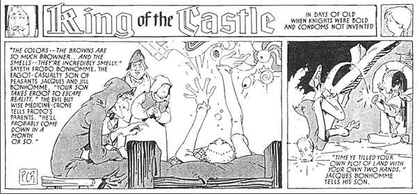
14 King
of the Castle, 1982-83, National Lampoon (April to July 1983
issues (?)).
One-page funny stories in each issue of the magazine.
|
|
|
15 Elric - Elric of Melniboné, 1982-84,
Pacific.
In Elric of Melniboné,
the first Elric paperback published by First Comics.
Drawn in collaboration with Michael Gilbert, the creator of
Mr. Monster and The Wraith, which makes for a
strange but interesting collaboration.
|

|
 |
|