The Opus list
Opus 16-30
|

|
16
The Drinking Song of Earth's Sorrow, 1984, Eclipse.
In Opera. Also in The P. Craig Russell Library of
Opera Adaptations vol.2 (see Collections).
A 4-page story adapting a song for orchestra by romantic composer
Gustav Mahler. Russell shows a man committing seppuku (Mishima
again ?) to illustrate this song written in XIXth century
Austria. Not the most obvious of choices, but the resulting
collage is intriguing enough.
|
|

|
17
The Insomniac, 1971-84, Eclipse.
In Night Music 2 (color), 1985, Eclipse.
Available in the collection Isolation
and Illusion, 2003, Dark Horse Comics.
|
|

|
18
Unto this World, 1984, Eclipse.
In Opera, also in The P. Craig Russell Library of
Opera Adaptations vol.2 (see Collections).
Another short adaptation of a song by Gustav Mahler (see Opus
16), this one is done in colored pencils, and the dream-like
ambiance of the strip fits the sorrowful text.
|
|

|
19
Jungle Book - The King's
Ankus, 1984-85, Eclipse.
In Night Music 3, 1985, Eclipse.
And in Jungle Book Stories (see Collections).
This is the first adaptation of one of the Kipling stories
entirely drawn by Russell. Mowgli, accompanied by the serpent
Kaa, discovers a jeweled dagger which will serve as a McGuffin
to teach the young man the folly of Man's greed. Apart from
the fact that Mowgli looks like one of the most beautiful boy
ever drawn, I particularly admire the way Russell manages to
make us believe in talking animals : they are drawn very
realistically, except for the dark lighting that is Bagheera,
and they come alive through their body language, their proud
ways and their non-human code of honor
|
 |
20
Eine Heldentraum, 1985, Marvel.
In Epic Illustrated 33.
Reprinted in The Ring of the Nibelung Book Four: Götterdämmerung
2, 2001, Dark Horse Comics.
From Hugo Wolf's setting of a Goethe's poem, this short opus
shows a dreamer despairing of the real world, a world so devoid
of the colors and joys of his dreams.
The reader will notice that the main character is modelled after
the same guy as the first Siegfried
version and the hero of Breakdown
on the Starship Remembrance.
|
|

|
21
Pelléas & Mélisande, 1985, Eclipse.
In Pelleas & Mélisande 1-2 (Night Music
4-5), 1985 and Opera (see Collections).
 Based
upon a play written by the symbolist Maurice Maeterlinck and
set to music by Claude Debussy, this is the story of the love
between Mélisande, a young woman married to an aging
prince and Pelléas, her young brother-in-law. Based
upon a play written by the symbolist Maurice Maeterlinck and
set to music by Claude Debussy, this is the story of the love
between Mélisande, a young woman married to an aging
prince and Pelléas, her young brother-in-law.  The
story uses a lot of foreboding, and Russell's art, being without
his more extravagant sides, slowly brings the reader to the
realization that the love between the two youth is doomed. Romantic,
yes, and very, very bleak in its view of the human condition. The
story uses a lot of foreboding, and Russell's art, being without
his more extravagant sides, slowly brings the reader to the
realization that the love between the two youth is doomed. Romantic,
yes, and very, very bleak in its view of the human condition.
|
|

|
22
Elric - The Dreaming
City (2nd version), 1986, First.
In Weird of the White
Wolf, the second Elric paperback published by
the now-defunct First Comics.
A summary of the Opus 10.
|
|
|
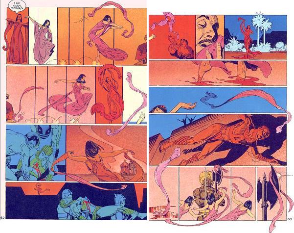
23
Salomé, 1986, Eclipse.
In Opera (see Collections).
The first adaptation by Russell of a story by Oscar Wilde,
set to music by Richard Strauss. Probably one of the best works
of Russell - and it is not easy to choose ! Salomé
might be a femme fatale, but she is a highly complex
one. She's definitely not the slut she's been described as,
but rather a pure-minded maiden who falls in love with Jokanaan,
a crazy prophet who has forsaken the pleasures of flesh. And
who would like others to do that as well. Everybody knows how
he will lose his head to the girl, but Russell's version gives
us a terrifying example of the wrath of a spurned woman. Russell,
now in complete control of his art, shows us in 32 pages the
madness born of love which engulfs Salomé. She will fall
prey to the anger of men, who can not accept her asocial behavior,
but the powerful meaning of her rebellion will fascinate artists
for twenty centuries.
|
|
 
|
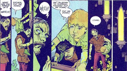
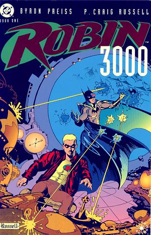
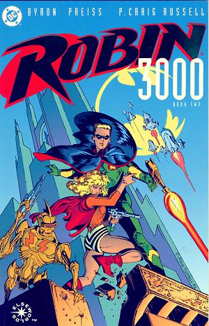
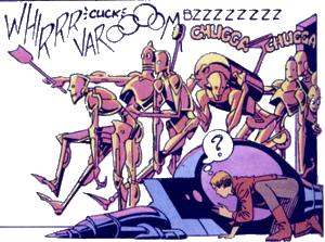
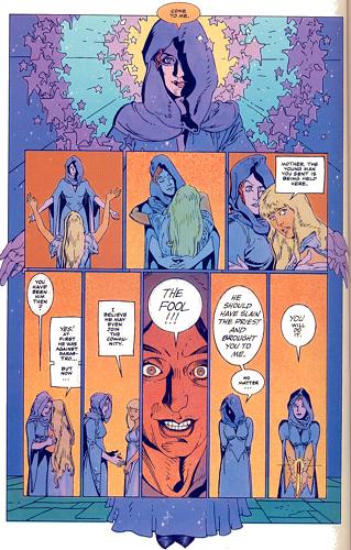
24 Batman
- Robin 3000, 1986-92, DC Comics.
Two 48-page prestige format comics in the Elseworld series.
A science-fiction story set in a future world where the current
Batman is killed, and the then-Robin takes over his mission
to rid Earth of its alien conquerors. I must admit not liking
that one very much, even if the art is quite nice, especially
with the cartoon robots populating this world.
| PCR's comments:
|
|
Unreleased in its original form, this work was
later published as Robin 3000 for DC Comics.
The Story of Tom Swift 3000/Robin 3000 or: It Seemed
Like A Good Idea at the Time. It was around '85 or '86 that
publisher/packager Byron Preiss approached me with the idea
of a book for young teenagers based on the old Tom Swift
series of books updated (all the way to the year 3000) and
presented as a series of graphic novellas. He was producing
it for Simon and Schuster, the publishing house that also
had the rights to the Nancy Drew and Hardy Boy books which
they were planning to relaunch. Tom Swift would tie in with
an eye to the comics market. Oboy, Simon and Schuster! I
was impressed. Now, most of my friends in Kent were in or
associated with the English department at Kent State University.
My being published by companies like First, Pacific, or
Eclipse meant nothing to them. Marvel had a certain cachet.
But Simon and Schuster? Eyebrows were raised. I admit it
was a part of the seduction like being asked to the dance
by one of the 'cool' kids... you hardly know the person
but everyone else is so impressed. Anyway, after just having
finished adaptations of works by the likes of Maeterlinck,
Kipling, and Wilde I thought it would be fun to draw a space
opera with all the sorts of hardware and futuristic backgrounds
I had not drawn since Killraven. A lark. "You know...for
kids."
I should have taken it as an omen when, shortly before
I was ready to begin, my model broke his arm. I found someone
else and got all my research photos. There was a short series
of delays, I forget why, and by the time I was back to it
my original model had his cast off and I started over, feeling
embarrassed having to tell the other person I wouldn't be
using him after all. I had never worked on a project in
which the script was being re-written in the course of drawing
it. I also had never had to deal, albeit second hand, with
such a hands-on art director as I had at S & S. I would
send in pages to Byron who would take them to S & S,
and then relay to me the needed changes. The most notorious
came at the coloring stage.
Speaking of coloring, let me digress for a moment. I learned
some valuable lessons on this project. One was never to
be rushed into inferior work. Early on, after a number of
pages had been inked Byron told me he needed a couple pages
colored immediately for a presentation, at a book fair or
what I'm no longer sure, but he needed them almost over
night. He sent me photostats of two pages that I was to
color on. Coloring on photo paper is notoriously difficult
and Michael T. Gilbert and I had evolved an elaborate system
of air brushing and frisket paper overlays to successfully
deal with it. But now there was no time for such an approach.
I hadn't even begun to think of what color schemes I would
be using and I hadn't the several day 'warmup' in which
one finds their coloring 'legs'. I told Byron I didn't think
I could do it justice under the circumstances but he assured
me it made no difference, the important thing was that we
have something, anything to show. I produced it and
it looked as smeary and uninspired as you might imagine.
I sent it off. Days later, I was imformed that S & S
had serious reservations about my coloring the book. All
previous examples of my coloring seemed to count for naught
in the face of these two photostat pages. Lesson-people
will only see what is immediately in front of them so don't
let yourself be bullied into producing less than your best...
for whatever reason.
But back to the coloring on the book. As I was ready to
start I told Byron I intended to color Tom's hair brown.
I'd done enough blonds and wanted some variety (I'd even
been called on it in some reviewtoo many blonds). Byron
said that was fine with him, he didn't want any "blond-haired
small toothed nazis"(!). I still remember holding the phone
out and looking at it. Blond-haired small tooth nazis? Well,
there goes the state of Minnesota. I let it pass. But we
both got our comeuppence when, after completing the coloring
and sending it in we were informed that Tom Swift had to
be a blond. The art director hath spoken. Has anyone ever
tried to repaint watercolor? I had to go in with a tiny
brush dipped in bleach and slowly leech out the brown color
and then go back in with a pale yellow. Yes, Tom Swift IS
a bleach blond.
I no longer remember all the revisions, but towards the
end an odd thing happened to me. I was working on the climactic
battle, a scene which to this day I'm proud of only because
it was so complicated in its action, choreographing many
characters engaged in actions both individual and simultaneous.
Just figuring it all out and making it flow from panel to
panel was a real challenge. But I started to feel a pressure
in my headlike when you are underwater. Budding hypochondriac
that I was, I was convinced that it was high blood pressure
and a stroke was imminent. Went to the Doctor. Blood pressure
was fine. She told me not to work so hard. Gave me sedatives.
I achieved a very smooth inking line.
So... it was finally finished, 58 pages and a cover designed
by Steranko (an 8 by 11 xerox layout that looked like he
tossed it off in a matter of minutes and was absolutely
spot-on in its dynamics and composition. I followed it exactly).
Nothing happened. It was slated for S & S's Spring schedule.
It was slated for S & S's Fall schedule. It was slated
for Spring. Then Fall. Finally it was slated for bupkis!
S & S was not going to be publishing graphic novels.
Lesson #2: Just When You Think You've Covered Everything
IN The Contract. Theres always a provision about the
return of original artwork, usually within 60 to 90 days
of publication. This is what I had in my contract with Byron.
But what happens if they don't publish? There it sits, in
the publisher's (or producer's) drawer. We (Star*Reach and
I) asked for it back... no dice.
Finally, some five years later, Byron took it over to DC
Comics and pitched it as an Elseworlds book. Tom would be
re-incarnated as Robin in the year 3000 and new material
would be added to incorporate Batman and bracket the story.
And why is this guy running around who is now called Robin
but is not dressed like him? Um... 'cause he's undercover...
yeah, that's it, he's undercover, thats the ticket.
So I called back my 'Tom' model, now married, a daddy, and
a good 25 pounds heavier and drew the new 18 pages and
produced a new cover for the second volumemy Wally Wood/EC
Comics/Sci-Fi homage.
And thats how a sweet little sci-fi nostalgia romp became
Robin 3000.
|
|
|

|
25
Jungle Book - Red Dog, 1987, Eclipse.
In Jungle Book Stories (see Collections).
First published as a comic-book, 1988, Eclipse.
The second Kipling story illustrated by Russell in which Mowgli
and his wolf-clan fight against a band of wild dogs. A bitter
tale which sees close friends of Mowgli die in battle, it is
as beautifully illustrated as the previous one. The deaths of
many animals, be they killers like the dogs, are never glorified.
They are only shown by Russell in all their horror and necessity
for those who want to survive. The jungle is definitely not
the Garden of Eden.
|
|

|
26
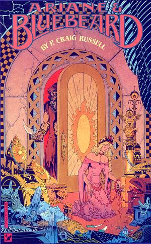
Ariane and Bluebeard, 1988, Eclipse.
One 48-page prestige format.
Reprinted in The P. Craig Russell Library of Opera Adaptations
vol.2 (see Collections).
Adapted from the opera by Maurice Maeterlinck (see Opus 21) and Paul Dukas, this is a new version of the classic
fairy tale of the man with the six wives. This version is very
different from the Perrault story. In Maeterlinck's version,
Bluebeard does not kill his wives nor does he die; his wives,
despite his brutal ways, stay with him, and Ariane leaves them
to their fucked-up relationship. As usual, Russell uses a combination
of realism in his figure-drawing and almost expressionism in
his coloring. He doesn't explain the characters behavior, but
rather, he exposes their acts and leaves the interpretation
to the reader. No armchair psychology here.
|
|

|
27
Human Remains, 1989, Eclipse.
A 31-page story in Tapping the Vein 1, an anthology
adapting Clive Barker's short stories in comics.
Also in Clive
Barker's Tapping The Vein, 2001, Checker Group Publishing.
Probably one of Barker's best short stories, certainly one
of the weirdest and also one the few with gay characters. A
meditation on time and identity, it focuses on a young prostitute
who finds himself replicated by a living statue. The thing is,
this man is vain, obsessed with the passing time which robs
him of his beauty, and thus of his identity. The statue becomes
more and more human, yearning for normality, leaving the original
with less and less to define himself. What will become of the
young man ?
Of course, Russell's depiction of the handsome man is perfect.
But more than that : this is one of the few times he does
not work from a fairy tale or an opera, but rather from a contemporary
story. And it makes one wish that could happen more often. As
solid in storytelling as any other work by Russell, but also
with a beautiful use of shadows and almost monochromatic scenes
- the latter being a constant of Russell's work. The intimist
scenes in flats are particularly striking : the quietness
of the blue ambiance is in stark contrast with the inner turmoil
of the characters.
Definitely one of the most powerful works of Craig Russell.
|

|
28
The Magic Flute, 1989-90, Eclipse.
Three 48-page prestige format comics, also published in one
paperback.
Collected in The
Magic Flute, 2003, NBM
Publishing.
Based upon Mozart's opera, this is the highly symbolic story
of love caught in the middle of the battle between light and
darkness. Not being particularly interested in Mozart's opera,
I can't say anything about Russell's interpretation, apart from
the fact that this is probably one of his most realistic-styled
works.  And
not once does the reader think that this looks too much like
a photograph, which Russell works very often from. Anyway, the
comic book itself is as reader-friendly as the other opera adaptations,
and one can enjoy this story without knowing anything about
Mozart's work. And
not once does the reader think that this looks too much like
a photograph, which Russell works very often from. Anyway, the
comic book itself is as reader-friendly as the other opera adaptations,
and one can enjoy this story without knowing anything about
Mozart's work.
|
|

|
29 From Beyond,
1994, Heavy Metal.
In Heavy Metal May '94.
Available in the collection Isolation
and Illusion, 2003, Dark Horse Comics.
An adaptation of a story by H.P. Lovecraft, this short and
not so sweet tale was originally to be published in an anthology
on Lovecraft edited by Steve Bissette. It didn't happen, and
the orphaned story found a home in Heavy Metal.
| PCR's comments:
|
|
Art and adaptation by P. Craig Russell. Color
by Digital Chameleon.
I was an omniverous reader of H.P.Lovecraft
in my teen years, so I was excited when approached by Steve
Bissette to provide an adaptation of one of his stories.
It would be for a collection being assembled by Steve that
would incorporate previously published material (Wrightson's
Cool Air, some Richard Corben) alongside newly-commissioned
work.
The reasons this project never came to fruition are so
convoluted that even as I tried to follow Steve's explanation
in The Comics Journal, I became hopelessly confused.
It boiled down to, as Steve told me over the phone, a 'clusterfuck'.
Several years later it was printed in Heavy Metal.
While chronologically the first, it was actually the second
story to be colored by Lovern. I'd like to try my hand someday
at another, or several, HPL stories.
|
|
|

|
30
The Golden Apples of the Sun, 1992, Bantam Spectra
Book.
In The Ray Bradbury Chronicles Volume 1.
Included in the Best of Ray Bradbury TPB, 2003, I
Books.
As the title suggests, this is a comic version of a short Bradbury
story. A spaceship travels to the sun to carry away a small
part of the blazing star, mostly for scientific purposes. The
text has a strong mythical undertone, which makes the reader
forget for a moment the physical impossibility of this trip.
I must admit that this not my favorite work of Russell, by far.
It's well done, but a bit bland for my taste.
| PCR's comments:
|
|
P. Craig Russell's contribution to this volume
of "authorized adaptations" of Ray Bradbury stories was
the art and adaptation for "The Golden Apples of the Sun."
Story by Ray Bradbury. Adaptation and art by P. Craig Russell.
The Golden Apples of the Sun by Ray Bradbury held
a special place in my heart. Bradbury was another of my
youthful passions and Golden Apples was the first
comic story I attempted. This was during my Junior year
at the University of Cincinnati several months before I
took time off to work in Dan Adkins' studio. It was a dreadful
adaptation of course, I hardly knew where to begin, but
I loved the material and so jumped at the chance when offered
it by Byron Preiss some 20 years later. I was especially
keen to try my hand at it as Bradbury is one of the most
difficult of authors to adapt. There is so much poetic and
evocative, actionless prose that the temptation of many
is to put everything in great blocks of copy. It's all so
beautiful that every cut line bleeds. One of the most successful
in the six volume series was Dave Gibbons' "Come Into My
Cellar", a really wonderful and inventive use of page design/panel
layout. Fresh and original. Anyway, looking back on it,
I feel very positive about this adaptation. There are panels
I would redraw, of course, but I think I was able to capture
and dramatise Bradbury's prose beyond merely cutting and
pasting chunks of copy. This was the last story of mine
in which I did the coloring before starting my collaboration
with Lovern Kindzierski.
|
|
|