Vellevision
I don't know about you, but I've always liked the short stories, either
in prose or in comics - and even in films. There's something in the
concentrated power of a ten-page prose story or a four- or five-page comic
which is specific to that format. One can think of Edgar Allan Poe, David
Leavitt, or the EC comics to realize what can be achieved in a few pages.
 That's
exactly what Maurice Vellekoop has accomplished. To my knowledge, his
longest story is only 6 pages long, and on average, the other ones must
be about 3 pages long. So, no From Hell, no Cerebus for
this artist. And yet, his themes are easily perceived, his personal universe
clearly defined. If his work has at first been published in various and
often hard-to-find comics anthologies, diving in Vellekoop's visions is
in fact not that difficult... That's
exactly what Maurice Vellekoop has accomplished. To my knowledge, his
longest story is only 6 pages long, and on average, the other ones must
be about 3 pages long. So, no From Hell, no Cerebus for
this artist. And yet, his themes are easily perceived, his personal universe
clearly defined. If his work has at first been published in various and
often hard-to-find comics anthologies, diving in Vellekoop's visions is
in fact not that difficult...
All the more as ninety percent of his comics work has been collected
in what could be one of the most beautiful book ever issued by a comic-book
publisher. Vellevision - what a title ! - is
a 112-page softcover book filled to the brim with, you've guessed, comics
and pictures, covering eleven years of work. This book is divided into
chronological/thematic chapters.
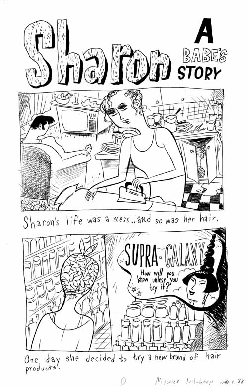
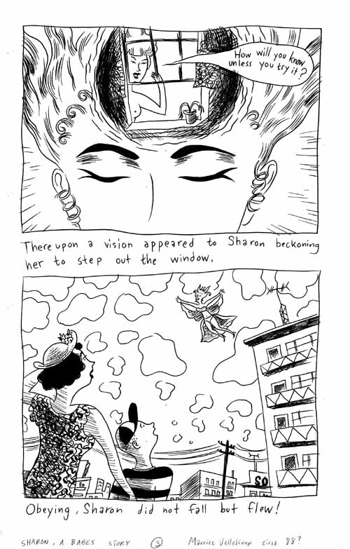
The first one is "Beginnings".  Here
we find stories drawn in 1985-86. The style is very angular, and the stories
are not particularly funny. Some of the themes dear to Vellekoop are already
here, like unrequited love, night life or loneliness in the big city. Here
we find stories drawn in 1985-86. The style is very angular, and the stories
are not particularly funny. Some of the themes dear to Vellekoop are already
here, like unrequited love, night life or loneliness in the big city.
The second chapter, "Guilt & Fear comics", acts as a reprint
for little-seen mini-comics of the same name published in 1986 and 1989.
A housewife feels guilty about not doing anything for third-world countries ;
a young guy who's been gay-bashed becomes paranoid about the dangers lurking
in the streets : these stories and others, about the little things
our lives are made of, already show the strengths of Vellekoop's work.
He's very perceptive about the things most people would consider as trivial.
What's important about a middle-class housewife watching too many starving
African kids, one might think.  Well, most of us Westerners
- and I don't mean that we live in Heaven, ok - are like her :
sheltered from war and destruction, we just send money when we feel too
guilty - or when the media feel too guilty. The art is also quite
interesting : in three years, we see Vellekoop's "mature"
style develop, getting rounder, softer. Even his men get rounder, striking
poses like the classic pin-up girls. That's another characteristic of
Vellekoop's art : the post-50's or 60's feel of his stories, the
pseudo-naivete of his themes. And his humor begins to appear, like in
the one-pager on the right. But more about that later. Well, most of us Westerners
- and I don't mean that we live in Heaven, ok - are like her :
sheltered from war and destruction, we just send money when we feel too
guilty - or when the media feel too guilty. The art is also quite
interesting : in three years, we see Vellekoop's "mature"
style develop, getting rounder, softer. Even his men get rounder, striking
poses like the classic pin-up girls. That's another characteristic of
Vellekoop's art : the post-50's or 60's feel of his stories, the
pseudo-naivete of his themes. And his humor begins to appear, like in
the one-pager on the right. But more about that later.
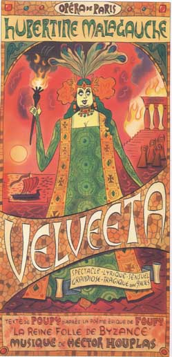
In the third chapter, "Music", we have a panorama of illustrations
by Vellekoop on that theme. 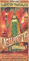 Music, and especially opera
(did I say Vellekoop and Russell had nothing in common ?), plays
a big part in Vellekoop's imaginative world. Look at this spoof of Alfons
Mucha's posters for Sarah Bernhardt. I must admit I can't resist the combination
of obvious love for the original work and the mischievousness towards
the pompous titles and ads. For the French-impaired reader, let me add
that "Malagauche" would mean something like "ill-at-left",
the ad reads "sensual, lyrical, grandiose, tragical show in 9 acts",
the title is "The Mad Queen of Byzantium" and "Houplas"
sounds very stupid and funny for me. Music, and especially opera
(did I say Vellekoop and Russell had nothing in common ?), plays
a big part in Vellekoop's imaginative world. Look at this spoof of Alfons
Mucha's posters for Sarah Bernhardt. I must admit I can't resist the combination
of obvious love for the original work and the mischievousness towards
the pompous titles and ads. For the French-impaired reader, let me add
that "Malagauche" would mean something like "ill-at-left",
the ad reads "sensual, lyrical, grandiose, tragical show in 9 acts",
the title is "The Mad Queen of Byzantium" and "Houplas"
sounds very stupid and funny for me. 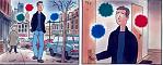 In this section, he also gives
us the imaginary biography of a conductor, a few illustrations from famous
operas, and a one-pager in which everyone should see oneself. Choosing
colors to show after-images (or should I write "after-music" ?)
is an elegant idea. The swirling sensations provided by music find a good
equivalent in these receding colors which the outside world slowly but
surely submerges. Once more, Vellekoop manages in a few panels to create
a situation which most artists do not even notice. In this section, he also gives
us the imaginary biography of a conductor, a few illustrations from famous
operas, and a one-pager in which everyone should see oneself. Choosing
colors to show after-images (or should I write "after-music" ?)
is an elegant idea. The swirling sensations provided by music find a good
equivalent in these receding colors which the outside world slowly but
surely submerges. Once more, Vellekoop manages in a few panels to create
a situation which most artists do not even notice.
 The fourth part, "Fabulous Babes",
is also the title of two comics Vellekoop did with two of his friends.
Warped sci-fi and gay melodrama, on display in this section, are here
to stay in the queer arsenal of Toronto's oddest artist - wait, doesn't
David Cronenberg live around there ? Anyway, Vellekoop's melodramas
are another of his making 50's and 60's popular culture over into all-new
romances which no straight artist would dare to tell anymore. The fourth part, "Fabulous Babes",
is also the title of two comics Vellekoop did with two of his friends.
Warped sci-fi and gay melodrama, on display in this section, are here
to stay in the queer arsenal of Toronto's oddest artist - wait, doesn't
David Cronenberg live around there ? Anyway, Vellekoop's melodramas
are another of his making 50's and 60's popular culture over into all-new
romances which no straight artist would dare to tell anymore.
 He
manages to use worn-out stories and, with his gentle humor, never mocks
his characters, but rather the conventions of a genre beside which super-hero
comics are a fountain of originality. He
manages to use worn-out stories and, with his gentle humor, never mocks
his characters, but rather the conventions of a genre beside which super-hero
comics are a fountain of originality.
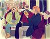
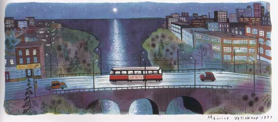
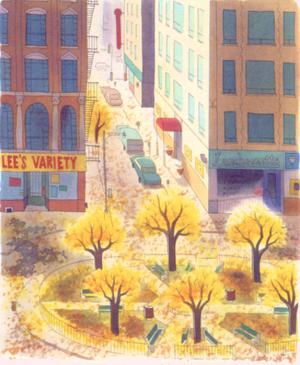
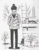
"Work" comes after "Music". 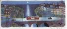 Two one-pagers in this section
are particularly beautiful : one is "Night Job", and the
other "Waiting". In "Night Job", a few people clean
offices late in the evening, and then catch a bus home. Two one-pagers in this section
are particularly beautiful : one is "Night Job", and the
other "Waiting". In "Night Job", a few people clean
offices late in the evening, and then catch a bus home.  Once again, Vellekoop shows
us the little moments in life, when nothing important is done, but which
take so much of our time. His mastery of color is especially obvious in
this strip and also in "Waiting". In the latter, the same spot
in the city is drawn in each season, and the result is really beautiful.
Peace and tranquility, not often found in cities, are here for everyone
to enjoy, conveyed by a choice of simple but well-used colors. Once again, Vellekoop shows
us the little moments in life, when nothing important is done, but which
take so much of our time. His mastery of color is especially obvious in
this strip and also in "Waiting". In the latter, the same spot
in the city is drawn in each season, and the result is really beautiful.
Peace and tranquility, not often found in cities, are here for everyone
to enjoy, conveyed by a choice of simple but well-used colors.
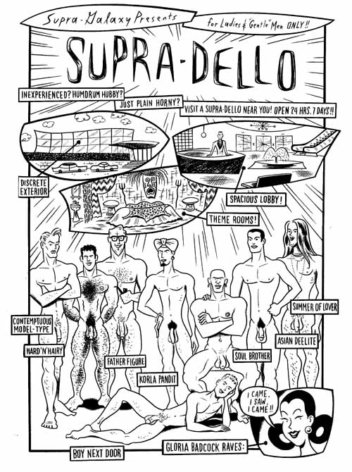
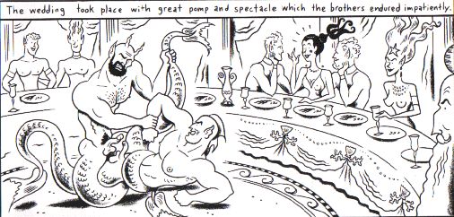
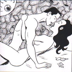
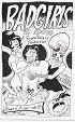
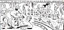 The
following chapter, "The World of Gloria Badcock", might be the
weirdest, and maybe even the queerest, of the book. In these three stories,
the longest he's done, the woman with the insulting name gets what she
likes : sex. The
following chapter, "The World of Gloria Badcock", might be the
weirdest, and maybe even the queerest, of the book. In these three stories,
the longest he's done, the woman with the insulting name gets what she
likes : sex.  With men, with E.T.s, with
tritons... In fact, we get an overview of human (and alien, too) sexuality.
The great thing is that all this is drawn in the Vellekoop style, round
and soft. None of his characters are bodybuilders, even if he knows how
to draw a well-muscled man ; his E.T.s seem to have landed in the
50's, and the whole strips combine some porn situations with a gentleness
in the characters which is totally unusual. We'll find that opposition
again in his ABC Book. With men, with E.T.s, with
tritons... In fact, we get an overview of human (and alien, too) sexuality.
The great thing is that all this is drawn in the Vellekoop style, round
and soft. None of his characters are bodybuilders, even if he knows how
to draw a well-muscled man ; his E.T.s seem to have landed in the
50's, and the whole strips combine some porn situations with a gentleness
in the characters which is totally unusual. We'll find that opposition
again in his ABC Book.

The last before one chapter's title is self-explanatory : "Illustrations".
 Vellekoop earns his life as a professional
illustrator, and he's worked for numerous magazines all over the world,
including Vogue, The New Yorker, Out, and other projects
like a promo book for the Smart. These three illustrations are not included
in Vellevision. See there
for newer illustrations. Vellekoop earns his life as a professional
illustrator, and he's worked for numerous magazines all over the world,
including Vogue, The New Yorker, Out, and other projects
like a promo book for the Smart. These three illustrations are not included
in Vellevision. See there
for newer illustrations.
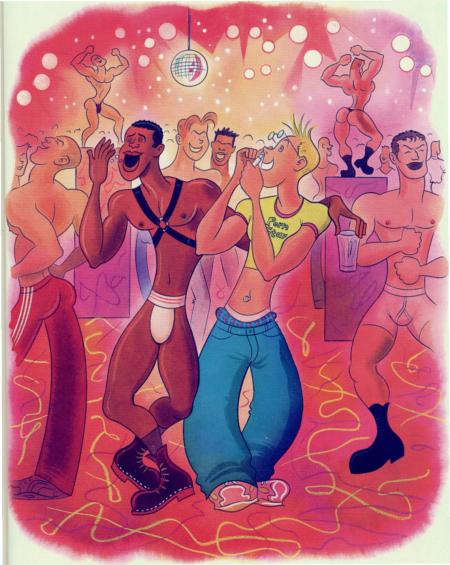
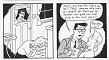
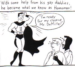
 The last chapter, "Gay Life"
probably includes some of the most personal work of Vellekoop. It opens
with "Maurice's Fairy Alphabet", a funny, tender, and sexy version
of our childhood books. Another high point is "Homoman", a very
funny - but too short - take on the Man of Steel. But for me,
the best story is "Side Door Lover", a totally unrealistic love
story between a rich man and a salesclerk. The last chapter, "Gay Life"
probably includes some of the most personal work of Vellekoop. It opens
with "Maurice's Fairy Alphabet", a funny, tender, and sexy version
of our childhood books. Another high point is "Homoman", a very
funny - but too short - take on the Man of Steel. But for me,
the best story is "Side Door Lover", a totally unrealistic love
story between a rich man and a salesclerk.  With lines like "Oh
darling, I didn't believe in angels 'till I met you.", and art
less cartoony than usual, this story, strongly reminiscent of 50's love
comics (Simon & Kirby, eat your heart out !), continuously navigates
between kitsch and humor, but as I've written before, never does Vellekoop
mock his characters. Maybe I'm a melo queen myself, but I must admit going
"How cute !" when I read these tales - and at the
same time, laughing at myself for thinking that. Maybe that's what Vellekoop
wanted... With lines like "Oh
darling, I didn't believe in angels 'till I met you.", and art
less cartoony than usual, this story, strongly reminiscent of 50's love
comics (Simon & Kirby, eat your heart out !), continuously navigates
between kitsch and humor, but as I've written before, never does Vellekoop
mock his characters. Maybe I'm a melo queen myself, but I must admit going
"How cute !" when I read these tales - and at the
same time, laughing at myself for thinking that. Maybe that's what Vellekoop
wanted...
For me, Vellekoop's art is an antidote for everything that hurts in our
cold-hearted world. It soothes and makes you smile, somehow like the classic
Hollywood musicals. His stories are definitely not seen through pink glasses
- no pun intended - but rather, with a gentle optimism which
makes one think, even for a short moment, that everything could
be alright with the world.
---------------------------------------------------------------
Addendum: A few pages from the book,
from a bookshop's
site which is selling the originals.
|


 The last chapter, "Gay Life"
probably includes some of the most personal work of Vellekoop. It opens
with "Maurice's Fairy Alphabet", a funny, tender, and sexy version
of our childhood books. Another high point is "Homoman", a very
funny - but too short - take on the Man of Steel. But for me,
the best story is "Side Door Lover", a totally unrealistic love
story between a rich man and a salesclerk.
The last chapter, "Gay Life"
probably includes some of the most personal work of Vellekoop. It opens
with "Maurice's Fairy Alphabet", a funny, tender, and sexy version
of our childhood books. Another high point is "Homoman", a very
funny - but too short - take on the Man of Steel. But for me,
the best story is "Side Door Lover", a totally unrealistic love
story between a rich man and a salesclerk. 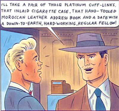 With lines like "Oh
darling, I didn't believe in angels 'till I met you.", and art
less cartoony than usual, this story, strongly reminiscent of 50's love
comics (Simon & Kirby, eat your heart out !), continuously navigates
between kitsch and humor, but as I've written before, never does Vellekoop
mock his characters. Maybe I'm a melo queen myself, but I must admit going
"How cute !" when I read these tales - and at the
same time, laughing at myself for thinking that. Maybe that's what Vellekoop
wanted...
With lines like "Oh
darling, I didn't believe in angels 'till I met you.", and art
less cartoony than usual, this story, strongly reminiscent of 50's love
comics (Simon & Kirby, eat your heart out !), continuously navigates
between kitsch and humor, but as I've written before, never does Vellekoop
mock his characters. Maybe I'm a melo queen myself, but I must admit going
"How cute !" when I read these tales - and at the
same time, laughing at myself for thinking that. Maybe that's what Vellekoop
wanted...